
Looking to start the process of designing your product packaging? To help guide you, we have put together 5 common packaging design mistakes we have seen over the years. By avoiding these pitfalls you will prevent redesign costs and ensure your packaging will look professional and instil brand trust. Help your packaging stand out for the right reasons.
1. Designing the packaging before testing it
It is vital tha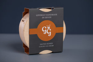 t you make sure the packaging fits your product before you progress to the design stage. Too often we are approached by clients who have spent a lot of money on packaging design, only to find that it needs to be edited as the product doesn’t fit inside. Make sure you get the technical drawings created first before you design it!
For example, Granny Gothards designed a food sleeve that needed to fit around their quality ice cream containers. The packaging had to be designed and tested first before they could apply their stylish branding and product information.
2. Spelling mistakes
It may sound obvious but you’d be surprised how many people notice typos on packaging! Whilst it might be a good way to get publicity, it’s not always the best way to promote your brand. Poor grammar and spelling mistakes can create an impression of unprofessionalism. Therefore, to build brand trust, checking and re-checking for any typographical errors is very important.
3. Bad photography
 A badly-taken photo of your product, especially food products, can make all the difference when the consumer is deciding on what to buy. If it doesn’t look appetising, it’s likely they’ll switch to a competitor instead. Perception is everything! Consumers are very visual, therefore imagery is one of the most powerful marketing tools you can use.
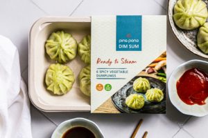
For example, Ping Pong Dim Sum have used mouth-watering imagery of their dumplings on the front of their packaging to entice the consumer to purchase their product.
4. Using the wrong materials
You need to make sure you get this right. Start by choosing a suitable substrate and test it first. Get advice from your packaging supplier and make sure you tell them how you’re intending to store, ship and sell your product so that it’s protected through the supply chain. Packaging that is disintegrating when it reaches the consumer is less than ideal.
5. Wasting money on expensive embellishments
 Often your designer might insist on special Pantone colours, foiling, embossing etc for your packaging. These can sometimes be expensive and cheaper alternatives that don’t compromise the quality can often be used. For example, if you’re a food brand selling into retail, you’re probably on a tight budget and need to protect your margins.
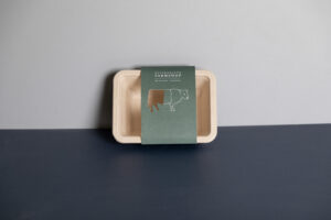
Pantone colours can sometimes be avoided by using a similar process (CMYK) colour match, and if you want to maximise on-shelf standout you can use clever die-cut techniques that have little impact on the unit cost. For example, Westmorland Farmshop has designed sleeves that wrap around their butchery trays with clever die cuts showing the cut of meat being sold.
If you are just starting to design your packaging or want some advice and would like to talk to a packaging expert about how you can perfect your packaging then we are always happy to help!
Looking for inspiration? View our case studies